Translation is often treated as a finishing job. The main website is approved, the presentation has been signed off and the campaign is ready to launch. Then someone asks for another language version, and the design has to absorb a completely different rhythm, structure and set of cultural expectations without changing very much.
Pentagram’s new identity for Design Doha Biennial 2026 shows the value of starting elsewhere. As Creative Boom reported on 19 October, the identity created by Samar Maakaroun and her team gives Arabic and English equal visual presence. Rather than stacking one above the other, the two scripts are woven into a shared typographic composition. Extended strokes connect the letterforms and allow the system to expand or contract across different formats.
The Biennial opens in Doha on 5 November, bringing together exhibitions, public projects and conversations from across the MENASA region and beyond. Pentagram describes the identity as a flexible system connecting languages, disciplines and voices. That is a design claim rather than evidence of commercial results, but the visible work supports a useful principle: if two audiences matter equally, that equality should be built into the communication from the beginning.
Language changes the shape of communication
Translating words does not automatically translate an experience. Different scripts bring their own direction, proportions, spacing and visual character. A phrase that sits neatly on one line in English may need a very different amount of room elsewhere. Navigation, calls to action, captions and animation can all behave differently once real content replaces the original copy.
That does not mean every language version needs to look identical. Parity is about giving each audience the same clarity and authority, not forcing every element into mechanical symmetry. The design needs enough structure to feel recognisable and enough flexibility to work naturally for the people reading it.
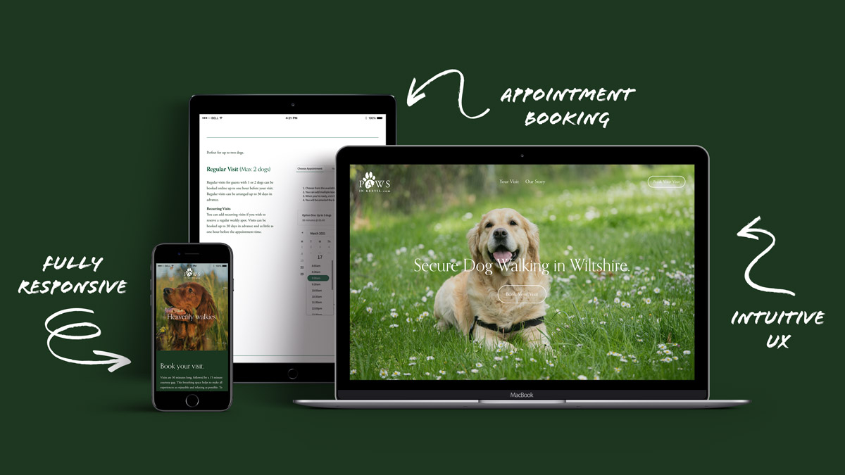
This matters beyond international cultural organisations. A growing business may need a multilingual website, a regional sales deck or materials for teams operating in different markets. If the brand system only performs comfortably in the language it was first designed around, every new version becomes a compromise.
Templates reveal whose needs came first
A template can protect consistency while still making communication difficult. A presentation master may have carefully defined title areas, yet leave no room for translated headings. A website component may look polished on desktop but break when a button label expands on mobile. The brand remains visually controlled, but the team spends its time shrinking type, rewriting sentences and finding workarounds.
Those are often treated as production problems. They are really clues about the brief. The system was designed around one finished example rather than the range of situations it needs to support. Questioning that assumption early can produce a better result for everyone, including the original audience.
Real content should be part of the design process sooner. Test important pages and slides in each language, on the smallest screens and in the longest likely headings. Bring local voices into the review, because accurate translation and confident communication are not always the same thing. A technically correct phrase can still feel stiff, unfamiliar or out of character.
Build for the audience you want to reach
A brand cannot make a poor service useful, and translation cannot hide an unclear offer. What considered design can do is make a good business easier to understand. When language, layout and hierarchy are developed together, the audience receives something that feels intended for them rather than adapted after the important decisions were already made.
For osmil, that is the wider lesson in the Design Doha identity. Future-facing communication is not simply about adding more versions or using newer tools. It means creating systems that can respond intelligently as audiences, channels and behaviour change. Sometimes consistency means keeping elements fixed. Sometimes it means allowing them to move so the message can remain clear.
If your next stage involves new audiences, branding, a more adaptable website or presentation templates built for real teams, let’s talk about what the system needs to handle.
Story reference: Tom May, Creative Boom, 19 October 2026. Project information from Pentagram and Design Doha. Analysis and recommendations are osmil’s perspective. Cover image is an AI-generated editorial illustration, not an image of the reported project.